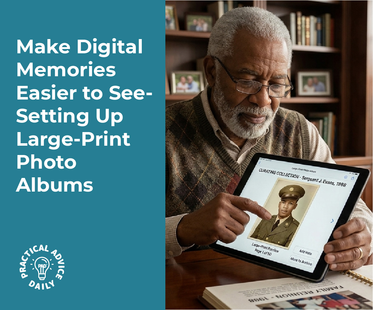
Photo albums connect people through shared memories, but standard digital albums often exclude users with low vision who struggle to see small text and low-contrast images. Creating high-contrast, large-font photo albums ensures that everyone, including those with visual impairments, can fully enjoy and engage with shared photos. This involves adjusting image contrast, increasing font sizes, and optimizing album layouts for better accessibility.

Many people with low vision require materials presented with strong color contrast and larger text to process visual information effectively. The combination of high-contrast images and large print significantly improves the user experience for individuals with visual impairments. These modifications benefit not only those with diagnosed vision conditions but also anyone viewing photos in bright sunlight or on smaller screens.
The process of making accessible photo albums is straightforward when following specific steps for image preparation, text formatting, and album configuration. By implementing these accessibility features, photo albums become inclusive digital spaces where all users can participate in preserving and sharing memories.
Table of Contents
Key Takeaways
- High-contrast images and large fonts make photo albums accessible for users with low vision and visual impairments
- Proper color contrast ratios and text sizing improve the overall user experience for all viewers
- Following accessibility guidelines when creating shared albums ensures inclusive digital memories for everyone
Preparing High-Contrast, Large-Font Images

Creating accessible photo albums requires attention to color contrast ratios, font selection, and image quality. The minimum contrast requirement of 4.5:1 ensures text remains readable for users with low vision, while proper font size and high resolution images maintain clarity across different viewing conditions.
Choosing Accessible Color Palettes
High contrast color schemes form the foundation of accessible image design. The most effective combinations pair light and dark colors that create clear visual separation, such as black text on white backgrounds or white text on dark blue backgrounds.
Accessible color palettes should avoid color combinations that users with color blindness cannot distinguish. Red-green combinations cause particular difficulty for many users. Instead, pairing colors with different lightness values ensures visibility regardless of color perception abilities.
High contrast images benefit from limiting the number of colors used. A simple palette of two or three high-contrast colors prevents visual confusion and reduces eye strain. Color accessibility tools can verify whether chosen combinations meet accessibility standards before finalizing image designs.
Ensuring Adequate Contrast Ratios
Contrast ratio measures the difference in brightness between foreground and background colors. The Web Content Accessibility Guidelines specify a minimum contrast requirement of 4.5:1 for normal text and 3:1 for large text.
Contrast testing tools calculate exact ratios between color pairs. These tools accept hexadecimal color codes or allow users to select colors directly from their designs. Meeting the 4.5:1 contrast threshold ensures text remains legible for users with low vision or color blindness.
High contrast materials often exceed minimum requirements by using stark black-and-white combinations or other maximum-contrast pairings. While 4.5:1 represents the baseline, higher contrast ratios provide better readability in challenging lighting conditions. Testing contrast combinations during the design phase prevents accessibility issues before images reach users.
Selecting Appropriate Font Size and Typeface
Large print materials use 18-point Arial as the standard base font size. This size provides adequate readability without requiring excessive space on the page. Headings should increase to 22 points for primary headings and 20 points for subheadings.
Sans-serif fonts offer superior readability for users with low vision compared to serif fonts. Arial, Helvetica, and Verdana maintain clear letterforms at various sizes. Font choice impacts how easily users distinguish individual characters, particularly letters like “I” and “l” or “O” and “0.”
Recommended font specifications:
- Base text: 18pt Arial
- Primary headings: 22pt Arial Bold
- Subheadings: 20pt Arial Bold
- Line spacing: 1.15
- Margins: 1 inch on all sides
Bold formatting should be reserved for headings only. Using bold for body text reduces the contrast between regular and emphasized text.
Saving and Exporting High-Resolution Images
High resolution images maintain clarity when printed or viewed on various screen sizes. Images should be saved at 300 dots per inch (DPI) for print materials and at least 150 DPI for digital albums.
File formats for low vision and print disabilities include JPEG for photographs and PNG for images containing text or graphics. PNG format preserves sharp edges on text and maintains high contrast without compression artifacts. JPEG works well for photographic content but may reduce text sharpness.
Accessible images require alternative text descriptions for screen reader users. Image descriptions convey the content and purpose of visual elements in 150 characters or less. Export settings should preserve color profiles to maintain intended contrast ratios across devices.
Designing for Accessibility and Usability

Accessible photo albums require adherence to established standards, intuitive navigation structures, comprehensive image descriptions, and verification through assistive technology. These elements ensure users with low vision can independently browse, understand, and enjoy shared photo collections.
Following Accessibility Guidelines and Standards
WCAG 2.1 and WCAG 2.2 provide the foundation for accessible photo album design. Level AA compliance requires a minimum contrast ratio of 4.5:1 for normal text and 3:1 for large text (18pt or 14pt bold). For high-contrast albums designed for low vision users, designers should target enhanced contrast ratios of 7:1 or higher to meet Level AAA standards.
The Web Content Accessibility Guidelines cover four core principles: perceivable, operable, understandable, and robust. Photo albums must present information in ways users can perceive regardless of visual ability. This includes providing text alternatives for images, ensuring sufficient color contrast, and allowing content to be resized up to 200% without loss of functionality.
WCAG 2.2 introduces additional success criteria relevant to photo albums, including focus appearance requirements and dragging movement alternatives. Designers should consult the most current web content accessibility guidelines to ensure compliance with evolving accessibility standards.
Integrating Accessible Navigation and Layout
Keyboard navigation allows users to browse photo albums without a mouse. All interactive elements must be reachable using Tab, Shift+Tab, Enter, and arrow keys. Focus indicators should have a contrast ratio of at least 3:1 against adjacent colors.
Navigation menus should maintain consistent positioning across all album pages. Breadcrumbs help users track their location within nested album structures. Skip links enable users to bypass repetitive navigation and jump directly to album content.
Whitespace and proximity create clear visual relationships between album titles, thumbnails, and descriptions. Headings organized in hierarchical order (H2 for album names, H3 for sections) allow screen reader users to navigate efficiently. Touch targets for buttons and thumbnails should measure at least 44×44 pixels to accommodate users with motor impairments.
Including Alt Text and Image Descriptions
Alt text serves as the primary way screen reader users experience photo content. Effective descriptions convey the essential information and context of each image without unnecessary detail. A photo of three people at a beach requires different alt text than a diagram showing architectural plans.
Alt text guidelines for photo albums:
- Describe the subject, setting, and relevant actions
- Keep descriptions under 150 characters when possible
- Avoid starting with “image of” or “picture of”
- Include text visible in the image
- Use empty alt attributes (
alt="") only for decorative images
Complex images benefit from extended descriptions placed in visible captions or linked long descriptions. Photo metadata such as date, location, and photographer names should appear as structured text rather than embedded within images.
Testing with Assistive Technology
Screen readers including JAWS, NVDA, and VoiceOver reveal how users with visual impairments experience photo albums. Designers should navigate albums with the screen turned off to identify missing labels, confusing navigation flows, and inadequate descriptions.
Color contrast analyzers verify that text and interactive elements meet WCAG requirements. The WebAIM Contrast Checker and Color Contrast Analyzer provide real-time feedback on foreground and background color combinations. Axe DevTools automates accessibility testing within browser developer tools, detecting issues such as missing alt text, insufficient contrast, and keyboard traps.
Manual testing complements automated tools. Users should verify that zooming to 200% doesn’t cause horizontal scrolling or obscure content. Testing with different viewport sizes ensures responsive layouts adapt appropriately. Real users with low vision provide invaluable feedback that technical testing cannot replicate.
Creating and Sharing Accessible Photo Albums
Accessible photo albums require careful organization, cross-platform compatibility, and collaborative features that accommodate users with low vision. These elements ensure that shared visual content remains usable through high-contrast designs, scalable text, and platform-independent accessibility features.
Organizing Images for Easy Access
Proper file organization begins with descriptive naming conventions that help users identify images without relying solely on visual previews. Files should use clear, specific names like “beach-trip-june-2026-group-photo.jpg” rather than generic labels like “IMG_0001.jpg”. This approach supports screen magnification users who may only see portions of filenames at once.
High-resolution images serve users who rely on pinch-to-zoom or screen magnification software. Images should maintain minimum resolutions of 1920×1080 pixels for photographs and 300 DPI for scanned materials. Mobile scanning apps like Microsoft Lens enable quick capture of documents and images at sufficient quality levels for low vision access.
Shared folders for accessible materials should include metadata descriptions within image properties. This information remains embedded in the file across platforms. For sourcing accessible stock images, platforms like Wikimedia Commons, Pexels, and Pixabay offer high-resolution options with clear licensing. The Tactile Graphic Image Library provides specialized accessible diagrams and accessible diagrams for low vision users.
File formats matter for compatibility. JPEG works well for photographs, while PNG format preserves text clarity when saving slides as PNG from presentations. Users can enhance image quality through tools like Picsart AI photo enhancement, Canva photo enhancement, or Adobe Express image enhancer before sharing.
Ensuring Accessibility Across Platforms
Platform selection determines how effectively users can access shared albums across different devices and assistive technologies. Google Photos supports up to 20,000 images per album and maintains image quality across mobile and desktop platforms. Apple Photos offers native integration with iOS accessibility features including VoiceOver and display accommodations.
Each platform handles zoom and magnification differently. Mobile apps generally support pinch-to-zoom gestures, while desktop interfaces require specific accessibility settings. Users should test albums on multiple devices to verify that high-contrast elements and large fonts render correctly.
Cross-platform considerations:
| Platform | Max Album Size | Native Zoom | Accessibility Features |
|---|---|---|---|
| Google Photos | 20,000 items | Yes | Screen reader support, high contrast |
| Apple Photos | Unlimited | Yes | VoiceOver, Display Accommodations |
| OneDrive | Varies by plan | Yes | Narrator support, contrast themes |
Cloud storage services like OneDrive enable folder-based sharing where contributors upload directly to shared folders for accessible materials. This method preserves original file quality and metadata. Files shared through links maintain their resolution and embedded accessibility features.
Collaborative Tools for Accessible Sharing
Collaborative album creation requires platforms that support multiple contributors while maintaining accessibility standards. Google Photos allows users to create shared albums where participants add photos, videos, and comments. The review feature lets album owners approve content before it appears publicly, ensuring all additions meet accessibility requirements.
Digital whiteboard platforms like Apple Freeform and Microsoft Whiteboard accommodate collaborative visual work with built-in accessibility features. These tools support image insertion, text annotation, and export functions that maintain quality for users with low vision. Classroom accommodations for low vision often incorporate these platforms for group projects.
Modern photo enhancement services integrate into collaborative workflows. Contributors can process images through reverse.photos to identify and improve image quality issues before adding them to shared albums. This proactive approach reduces accessibility barriers.
Essential collaboration features:
- Link-based sharing that doesn’t require account creation
- Upload permissions for multiple contributors
- Comment threads for discussing image accessibility
- Download options that preserve original resolution
- Email and messaging integration for notifications
Contributors should establish guidelines for submissions that specify minimum contrast ratios, font sizes for text overlays, and resolution requirements. These standards apply equally to accessible PowerPoint exports, accessible classroom posters, and accessible memes shared within albums.
Best Practices for Inclusive Digital Memories
Accessible photo albums require ongoing attention to maintain their usability for people with low vision. Audio descriptions and tactile alternatives extend access beyond visual formats, while educational institutions and cultural organizations offer valuable resources for creating truly inclusive digital memories.
Maintaining Accessibility When Updating Albums
Regular maintenance ensures photo albums remain accessible as content grows. When adding new images, each photo requires descriptive alt text that conveys essential visual information without unnecessary detail. The alt text should identify people, locations, and significant actions in 1-2 sentences.
High-contrast settings and large fonts must remain consistent across all album updates. If the original album uses 22pt fonts with a white-on-black color scheme, new pages should match these specifications exactly. Inconsistent formatting forces users with low vision to repeatedly adjust their viewing preferences.
Key maintenance checklist:
- Verify all new images include alt text descriptions
- Confirm font sizes remain at 22pt or larger
- Test color contrast ratios meet minimum 7:1 standards
- Check that text doesn’t overlay images
- Ensure captions use CamelCase for proper screen reader interpretation
Cloud-based shared albums may reset accessibility features during platform updates. Album creators should review settings quarterly and notify album members about any required adjustments to viewing preferences.
Providing Audio and Tactile Options
Audio descriptions transform visual memories into accessible experiences for users with low vision. Audio narrated images pair spoken descriptions with photos, allowing family members to record personal stories about each image. These narrations capture emotional context and details that standard alt text cannot convey.
Recognizing images with Seeing AI and similar tools provides immediate audio feedback about photo content. These smartphone applications describe faces, text, objects, and colors within images, giving users independence when browsing albums.
Tactile images and accessible diagrams convert important photos into raised-line drawings that users can explore through touch. Museum archives and university libraries maintain tactile graphic image libraries that demonstrate effective conversion techniques. These institutions offer consultation services for families creating tactile versions of significant photographs.
Closed captions benefit users who rely on both audio and visual information. When sharing video content in photo albums, accurate captions ensure all dialogue and sound effects are accessible.
Educational and Community Resources
University libraries provide free accessibility consultations and assistive technology training. Many institutions offer workshops on creating accessible digital content, including specialized sessions on photo album accessibility. These programs teach families how to implement math test accommodations principles to visual memories, ensuring complex diagrams and charts remain interpretable.
Museum archives demonstrate professional standards for accessible images through their digitized collections. These institutions employ specialists who create detailed descriptions for artwork, historical photographs, and artifacts. Their publicly available guidelines translate to personal photo albums.
Available resources include:
- Digital accessibility workshops at public libraries
- Online tutorials from cultural institutions
- Screen reader software training programs
- Tactile graphics production services at specialty print shops
- Community centers offering assistive technology demonstrations
Local organizations serving people with visual impairments maintain resource lists and connect families with accessibility experts. These groups often host peer learning sessions where members share successful strategies for making photo albums inclusive.
Final Thoughts
Making digital photo albums easier to see is not just about larger text—it’s about creating a more welcoming experience for everyone. By using strong contrast, readable fonts, clear layouts, helpful alt text, and accessible sharing tools, you can turn a simple album into an inclusive space where people with low vision can enjoy memories independently. Small improvements like consistent formatting, better image quality, and regular accessibility checks can make a big difference over time. When albums are designed with care, family photos become easier to browse, share, and enjoy for every viewer.